Color Psychology in Home Design: Choosing the Right Palette for Your Style


Understanding Color Psychology
Color psychology is a fascinating branch of study that explores how colors influence our moods, emotions, and behaviors. At its core, it seeks to explain why certain shades evoke specific feelings, which can vastly affect our experiences in various environments, particularly in home design. Each color carries with it a unique energy that can uplift, soothe, stimulate, or calm. Understanding these effects can significantly enhance the choices we make when designing our living spaces.
Scientific principles underpin the study of color psychology. Research indicates that colors can trigger physiological responses and psychological effects. For instance, warm colors like red and yellow are often linked to feelings of warmth, comfort, and excitement, while cool colors like blue and green promote tranquility and serenity. This understanding allows designers to intentionally choose colors that align with the intended atmosphere of a room. It is essential to consider the emotional impact of colors when selecting palettes, as these choices can influence daily life within a home.
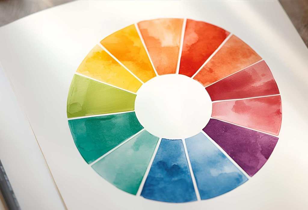
Color theory is an integral aspect of color psychology, encompassing the relationships between colors, color harmony, and how to effectively combine colors within a space. It provides guidelines for creating visually appealing and emotionally resonant environments. The color wheel is a foundational tool in this theoretical framework, helping designers understand primary, secondary, and tertiary colors, as well as complementary and analogous color schemes. By applying color theory to home design, one can craft spaces that not only look aesthetically pleasing but also foster certain moods and atmospheres, ensuring that the environment speaks to the inhabitants’ preferences and lifestyles.
Popular Color Palettes and Their Meanings

Color is an essential part of home design; it shapes the ambiance and can influence emotions and behaviors. Various color palettes are popular in home design, each conveying particular meanings and psychological effects. One noteworthy palette is the calming blue, which evokes tranquility, promotes relaxation, and enhances focus. This soothing hue is ideal for bedrooms and bathrooms, where serenity is paramount. Light shades of blue can open up spaces, making them feel larger and more airy, while deeper blues can create an intimate atmosphere.
Next, energizing yellows are known for their uplifting properties. This cheerful, sunny hue stimulates mental activity and fosters creativity. It is often used in kitchens and dining areas to evoke warmth and energy, making them inviting spaces for family and social interactions. Yet, it is important to use yellow in moderation, as overly bright shades can be overwhelming. Pairing yellows with more neutral colors can balance their vibrancy, creating a harmonious environment.
Another significant color palette comprises grounding earth tones. These colors, including shades of brown, beige, and olive green, give a sense of stability and comfort. They are often linked to nature, promoting a feeling of connection to the outdoors. Earth tones are versatile and can be utilized in living rooms or dens, offering a warm and inviting atmosphere. The psychological effects of these colors can help create spaces that feel safe and secure.
Ultimately, the right color palette will depend on personal preferences and the intended purpose of each room. By understanding the meanings linked to various colors, homeowners can create environments that not only show their style but also promote well-being and positivism.
Choosing the Right Colors for Your Home Style

Choosing the right colors for your home is a fundamental aspect of interior design that can significantly influence the overall ambiance of your space. To start, it is essential to analyze your existing decor. Take note of the primary colors found in your furniture, artwork, and textiles. This will serve as a foundation for your color choice. It is vital to find a cohesive theme that aligns with your personal style, whether it is contemporary, traditional, or eclectic.
Next, consider the purpose of each room when choosing your color palette. For instance, soft, muted tones often create a serene atmosphere in bedrooms, promoting relaxation and restful sleep. On the other hand, vibrant colors can invigorate spaces like kitchens and offices, stimulating creativity and energy. Understanding the intended role of each area can guide you in selecting colors that complement and enhance the space.
Additionally, it is crucial to incorporate your personal preferences into the decision-making process. Consider the colors that resonate with you and evoke positive emotions. Creating a mood board can help visualize how different shades work together. Use shades from the same color family or complementary colors for a balanced effect, ensuring that the chosen palette feels harmonious throughout the home.
Combining colors effectively is also essential for creating a cohesive design. Use the 60-30-10 rule, where 60% of the room features a dominant color, 30% a secondary color, and 10% an accent color. This approach promotes balance while allowing for personal expression through strategic pops of color. By considering existing elements, the functionality of each room, and personal taste, one can successfully curate a color palette that enhances the overall aesthetic of the home.
Practical Tips for Implementing Color in Your Home

When considering how to effectively incorporate color into your home design, beginning with a well-thought-out palette is essential. Start by selecting a primary color that resonates with you and aligns with your aesthetic vision. To complement this base color, choose two or three accent colors that harmonize well. These choices will create a balanced visual impact throughout your home.
Painting walls is one of the most straightforward ways to set up your chosen color palette. Opt for shades that either enhance or contrast with your furniture. For smaller spaces, lighter hues can create an illusion of expansiveness, while darker tones can add depth and coziness to larger areas. Consider using an accent wall to introduce a bold color without overwhelming the space. Additionally, a matte finish can offer a softer look, while glossy paints can mirror light and create a vibrant atmosphere.
Furniture and accessories play a crucial role in reinforcing your color scheme. Choose items that incorporate your selected palette. For instance, upholstered furniture, like sofas and chairs, can offer an opportunity to introduce patterns or colors that mirror your wall choices. Complement these pieces with throw pillows, rugs, and curtains that further express your desired aesthetic. Textiles offer a flexible way to experiment with different textures and shades, enhancing your home’s overall ambiance.
Lighting is another vital aspect that influences how colors are perceived in your space. Natural light can bring out the true tones of your chosen colors, while artificial light can alter their appearance. To enhance your color choices, consider installing adjustable lighting solutions. Incorporate different light sources, like floor lamps, table lamps, and overhead lighting, to create layers and keep the desired mood throughout various times of the day.


